 | |
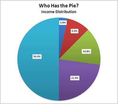
| percentages of income for the groupings |
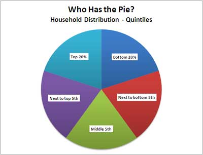 | |
| color chart for the groupings |
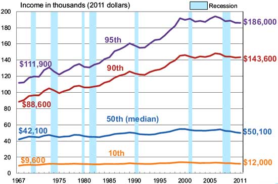 If you are into graphs then this may be your cup of tea. If you have seen your buying power reduced over the past 15 years this may help you understand. If you have been kicked to the curb in the past 10 years this is what happened.
No comments:
Post a Comment